TPT Retirement Solutions is one of the UK's leading pension providers, with over 80 years of expertise, £11.4 billion in assets under management, and 490,000 members across 2,400 employers. Founded in 1946, TPT's singular focus is pensions — offering defined benefit, defined contribution, and collective defined contribution solutions, alongside fiduciary management and superfund services. The project was to design a new website that could carry the weight of that heritage while making genuinely complex financial subject matter accessible to employers, trustees, scheme members, and professional advisers.
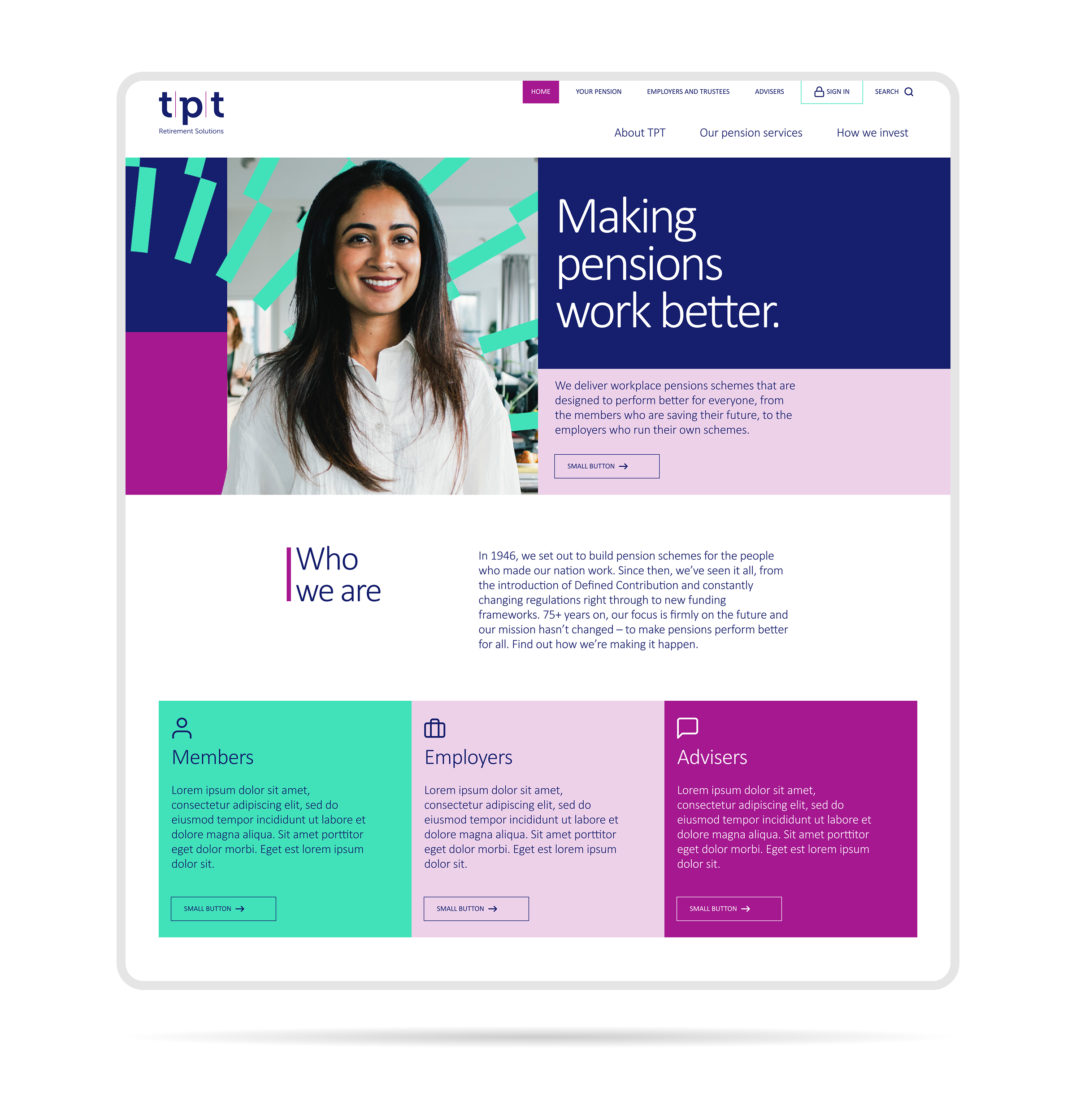
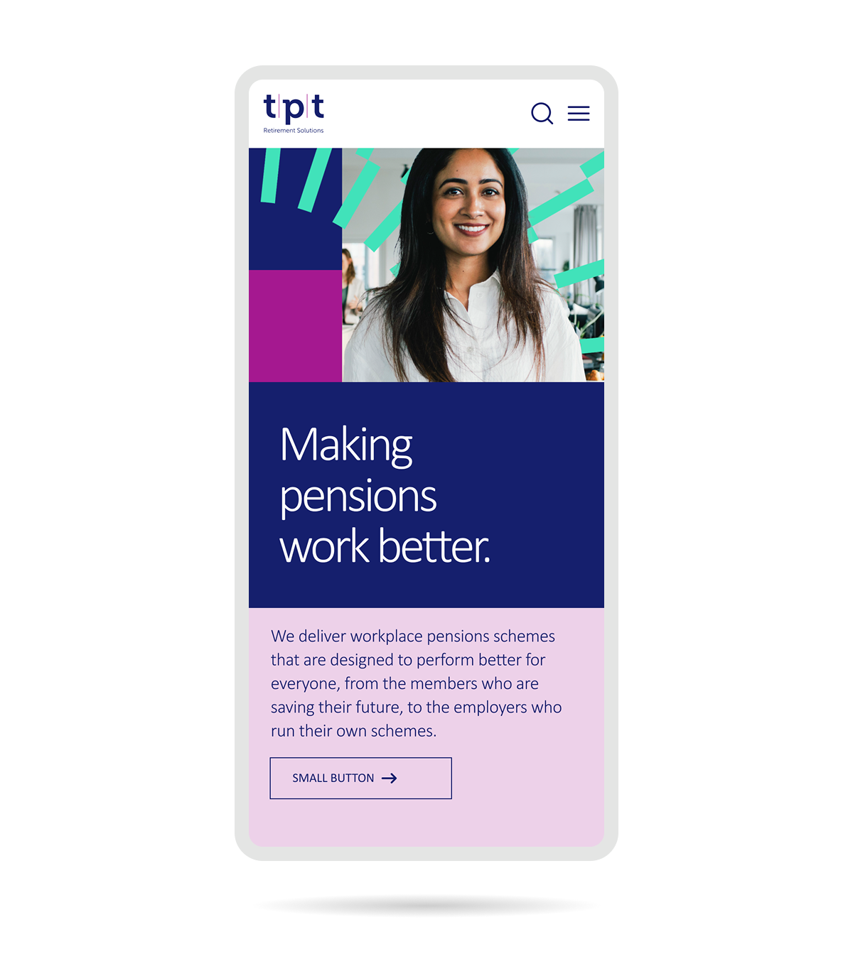
TPT's brand identity had been developed by an external agency — a bold, distinctive visual language built around geometric precision, complex layered patterns, and a typographic system designed for high-impact print. The brief was not to reinterpret the brand, but to honour it: every colour token, typographic rule, spacing rhythm, and graphical motif had to be understood and preserved before a single web component was designed.
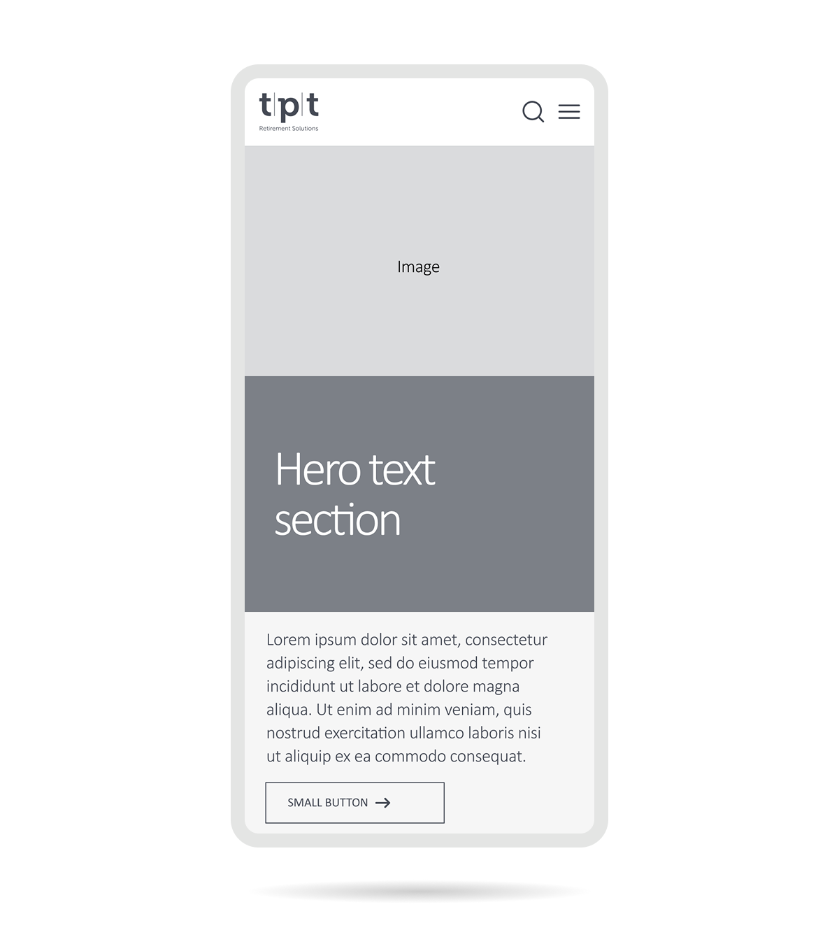
The design process began with a thorough audit of the brand guidelines, followed by close collaboration with the brand agency to ensure all digital interpretations were informed and approved. The website architecture was then built around TPT's multiple audience types — each with distinct needs and entry points — ensuring that complex pension information could be navigated clearly without sacrificing the brand's authority and character.
The most technically demanding aspect of the project was translating TPT's intricate decorative patterns and graphical elements from print to the web. These assets — designed for high-resolution output in Illustrator — relied on vector precision, layered geometry, and multi-axis gradients that have no direct equivalents in CSS.
Reproducing them faithfully required a bespoke approach for each motif: combinations of CSS transforms, clip-path, pseudo-elements, and inline SVG were used to approximate the print originals as closely as possible. Sub-pixel rendering of fine diagonal lines proved particularly unpredictable across browsers and screen densities, requiring extensive cross-device testing to ensure the result felt deliberate. The outcome was a library of reusable CSS components that gave developers a brand-accurate toolkit — allowing the visual language of a print-first identity to live credibly on screen without compromising performance or long-term maintainability.