
HMA made a strategic decision to target the health, science and technology sectors and as a result they wanted to refresh their visual identity and to ensure it aligns with their ambitions and the delivery of their customer promise.
Branding
Visual Identity
Typography
Ilustration
Photography
Tone of voice
Illustrator
Photoshop


User research
Workshops

Problem statements

Brainstorming
Sketching

Mockups

User testing
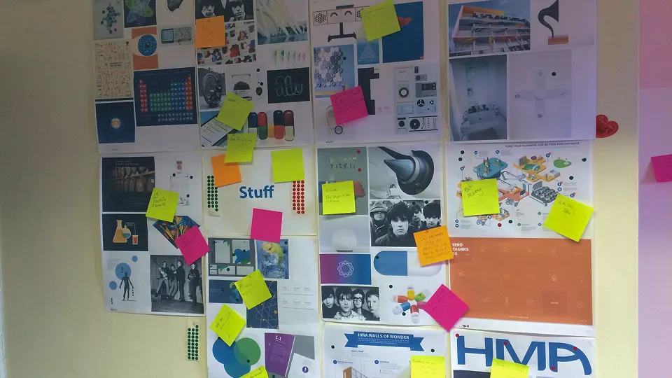
A creative space was set up in the office to encourage staff to contribute ideas freely without pressure. The space featured mood boards, suggestion areas, and interactive brainstorming tools, allowing team members to share thoughts visually and collaboratively. This open environment fostered creativity, enabling diverse input and fresh perspectives to shape design decisions.
After the all the research data was collated and various workshops with key stakeholders the following was what we define what the focus should and shouldn't be on.
HMA should be:
• Friendly
• Have personality
• Simple
• Creative
• Approachable
• Professional
• Beautiful
• Clean
HMA shouldn't be:
• Messy
• Boring
• Bland
• Uninspiring
• Complicated
• Chaotic
• Disorganised
Ideas were genrated from a capsule shape because it could potentially be used and adapted to meet the Health, Science and Technology requirements


